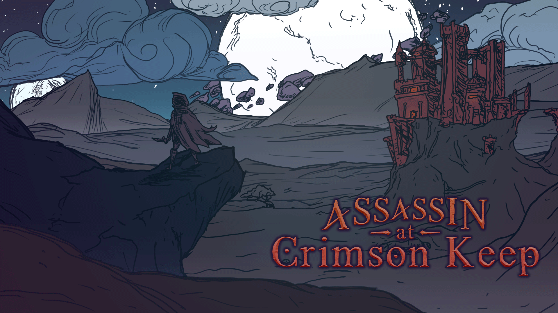
Assassin at Crimson Keep
Art Part 1: Pitfall
When making a Visual Novel, you should really work on the Visuals.
Shocking, I know. I bet you're glad to be reading this devlog for such unprecedented advice. Don't worry. I'll uncover more indie secrets later on.
I jest, of course, but it's something I want to point out when working as a solo dev. Up to any art being created, I already had the story, or at least an outline of it. The second thing I figured out was the game engine I would use. Only after that did I really even think about what the game would look like.
Now, if your main talent is art, there's nothing wrong with starting with the Visuals. That would definitely get you going on the marketing side of things as early as possible. For me, while my art is pretty good, I'm not sure it has the punch most people are looking for. In fact, up until the last two months of development, I didn't even have what the Assassin looked like.
I had done plenty of sketches and came up with a few concepts. The one thing that I knew was going to be the driving aesthetic was it would be a combination of Fantasy and Science Fiction. Other than that, I didn't know where else it was going.
ASSASSIN
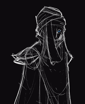
The initial concept was something that I really enjoyed. I love sketching white on black, rather than the usual black on white. It does something for my creativity.
Knowing color is my weakness, I figured I'd actually keep this style and draw the whole game like it. But honestly it just wasn't fully pleasant to see everything in black and white. It got old really quickly.
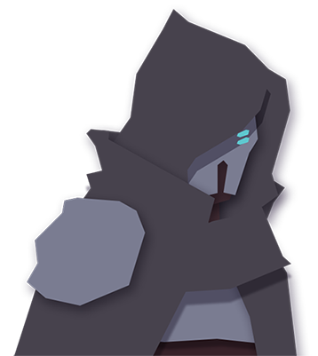
That's when I moved on to shapes only. I abandoned the Hashshashin route, and to be honest, I don't know why. I think I had trouble making it look good with the shapes and just moved on.
This one also felt like it fit the Sci-Fantasy aesthetic I was going for a bit more. But again, just shapes was pretty boring to look at.
Obviously, this is just a painted version of the shapes. I love this, and really I would have liked to make the rest of the game like this (though I would need to brighten it up; I can't see anything!).
But this is where time-management comes into play. I am not a fast painter. I'm a slower artist, but I am a snail when it comes to painting. It's just one of those thing that I could never grasp.
I knew this wouldn't be sustainable for any of the other characters, so I abandoned it. Even this little portrait you can see is unfinished.

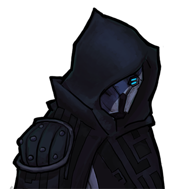
And now we come to the final Assassin. I drew and colored this guy in maybe two days, which may not sound very fast, but for me, that makes me practically the Flash!
I didn't find this style until May of 2021. I was playing Darkest Dungeon, and loved the vibe. I knew my game couldn't be that dark, but I liked the use of shadows and lines, very Mignola-esque.
This wasn't a direct style copy, and I didn't want it to be. I don't have complete black anywhere, at least intentionally. I sketched the shadows quickly so it always has some breaks.
Color I have never been good with. So I made the conscious choice to use a color palette. I think it worked out very well, and compared to the previous iteration above, this guy really pops!
One thing I've always shot for (though rarely hit my mark) was to give the sense of dimensionality with just the line art and I think it work, considering I have nothing but flat colors (apart from the visor lens).
DONE?!
The main character was done. I hadn't planned on any animation whatsoever, so after this picture was finished I had to decide what to do next. The Princess had to look great too, even if she barely shows up in the game.
This was actually a huge problem for me, but this devlog is already too long to get into, so I hope you'll check back next time to find out the corner I painted myself into.
Leave a comment
Log in with itch.io to leave a comment.